Noted: New Logo for IKEA
“No Assembly Required”

(Est. 1943) "IKEA is a Swedish-founded multinational group that designs and sells ready-to-assemble furniture, kitchen appliances and home accessories, among other useful goods and occasionally home services. It has been the world's largest furniture retailer since at least 2008. It was founded in Sweden in 1943 by 17-year-old carpenter, Ingvar Kamprad, who was listed by Forbes in 2015 as one of the ten richest people in the world, worth more than $40 billion. The company's name is an acronym that consists of the initials of Ingvar Kamprad (name of founder), Elmtaryd (the farm where he grew up), and Agunnaryd (his hometown in Småland, southern Sweden). As of November 2018, there are 424 IKEA stores operating in 52 countries." (Wikipedia)
Design by
N/A
Related links
N/A
Images (opinion after)


Opinion
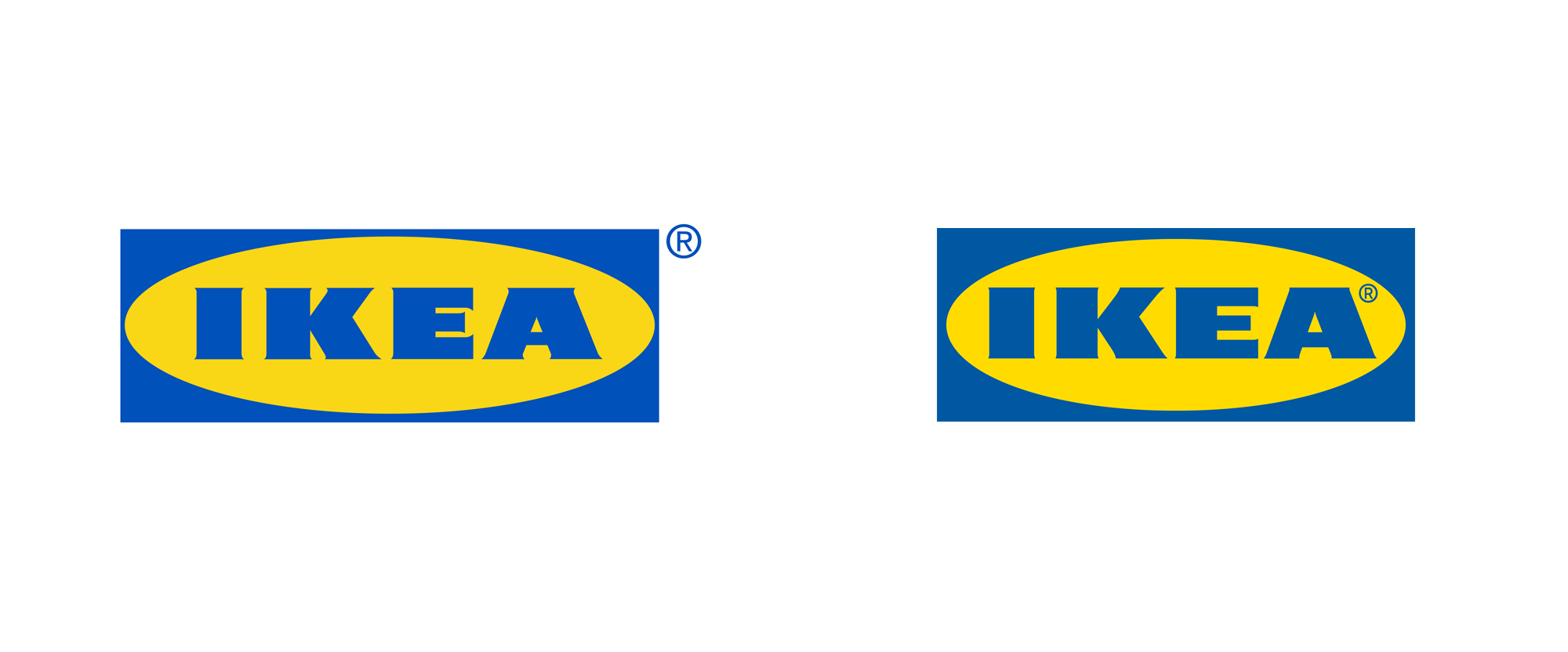
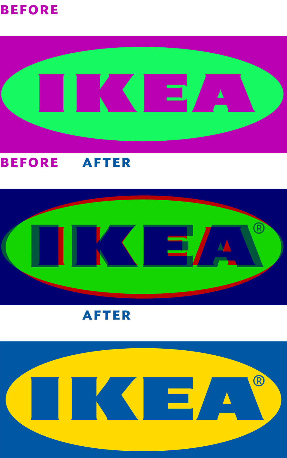
Looking at the header image you are probably all, like, “Nah, it’s the same”, and that was my initial reaction when I got the tip. Luckily, the international site and the U.S. site each had an SVG file so I was able (and now you are too) to look at all the adjustments they made. Most “notable” is the increased height of the oval that allows the letters to be a tad bigger. The flares in the letters have been reduced, which were particularly busy in the old “E”, making that letter look heavier. The counterspaces of the “A” have been opened up and the angles of the “K” have been modified. The “I” still floats a little on the left but that’s a hard word to kern. Is the new version better? Maybe. Is the slight change worth the hassle of updating things? I’m not so sure. I’m usually a big proponent of little tweaks that allow a logo to perform better but I don’t think this is such a huge technical improvement that it merits the headache of making sure all new communications use the new logo instead of the old one and I doubt any of the stores will be updating their big-ass signs. But, hey, it’s IKEA’s world, we just live in it — so, göod for them.

