
Reviewed: Friday Likes 280: From Designstudio B.O.B., CODO Design, and Studio Makgill

“From Designstudio B.O.B., CODO Design, and Studio Makgill”
A series of fun packaging projects for things that make your body feel good, with work from Düsseldorf, Indianapolis, and Brighton.
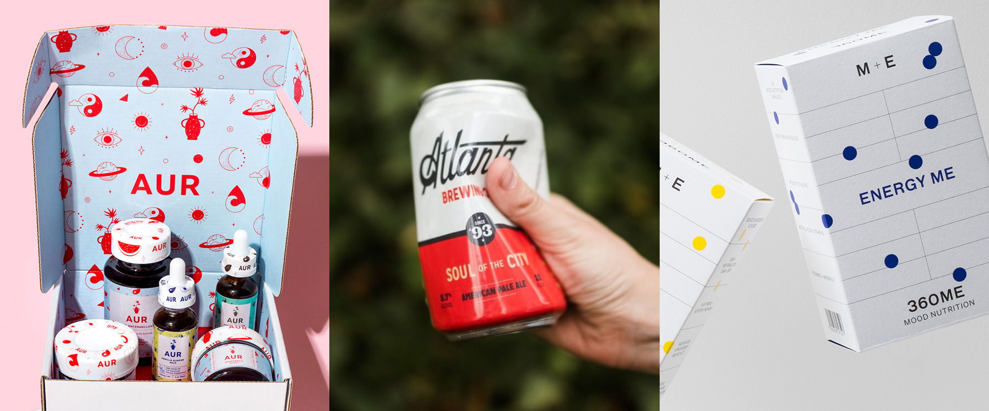
AUR Body by Designstudio B.O.B.
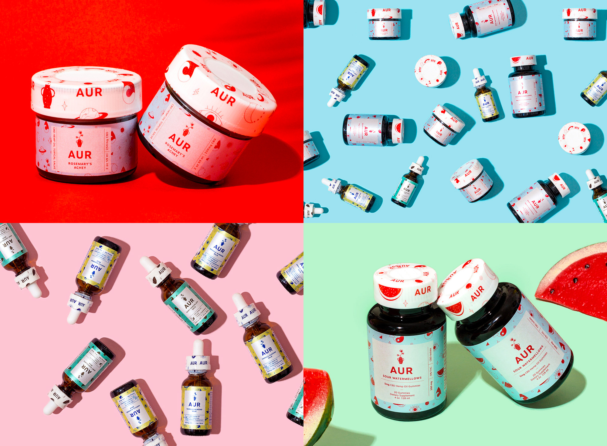
AUR Body is a California-based company that uses CBD hemp oil to produce body oils, tinctures, gummies, and bon bons. The packaging, designed by Düsseldorf, Germany-based Designstudio B.O.B., employs a bevy of tiny illustrations that range from the descriptive, like watermelon or vanilla to identify flavors, to the metaphysical, like the yin yang or all-seeing-eye. The illustrations are nice and everything but it's their use at such small sizes that makes them more interesting and in particular their use on the tear-away plastic wrap where they contrast perfectly with the white caps. The texture in each of the products is really great and given that CBD oil containers are so tiny these ones pack a punch. See full project
Atlanta Brewing Company by CODO Design
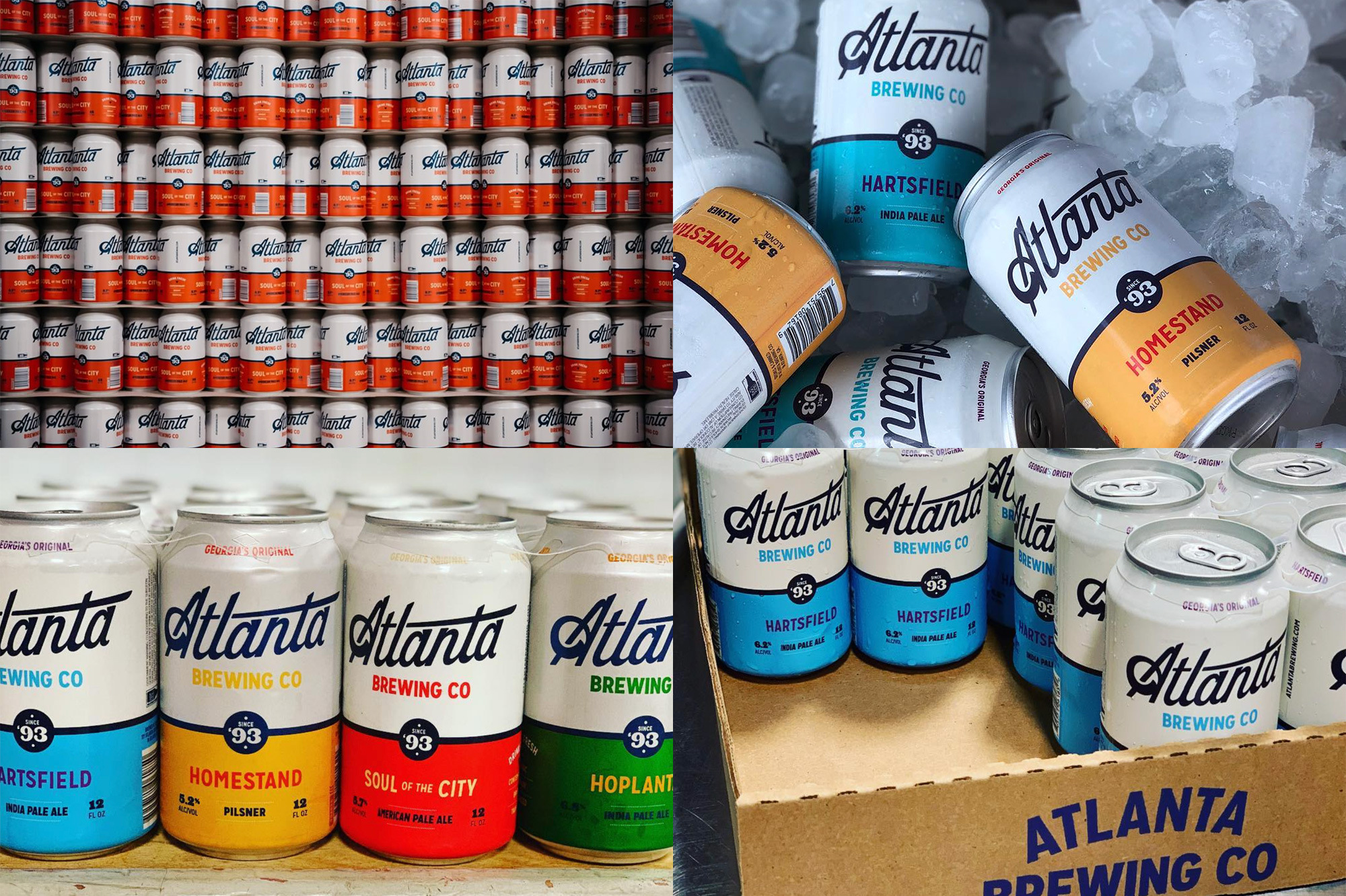
Atlanta Brewing Company, formerly Red Brick Brewing (from 2010 to 2018), is Atlanta, GA's oldest craft brewery. Last year, to commemorate their 25th anniversary, the brewery went back to its original name and introduced a new identity and packaging designed by Indianapolis, IN-based CODO Design. With a killer script logo as the anchor, that can be neatly shortened to "Atl", the identity and packaging complement it with simple and bold typography, large color blocks, and lovely typographic details throughout. See full project
360ME by Studio Makgill
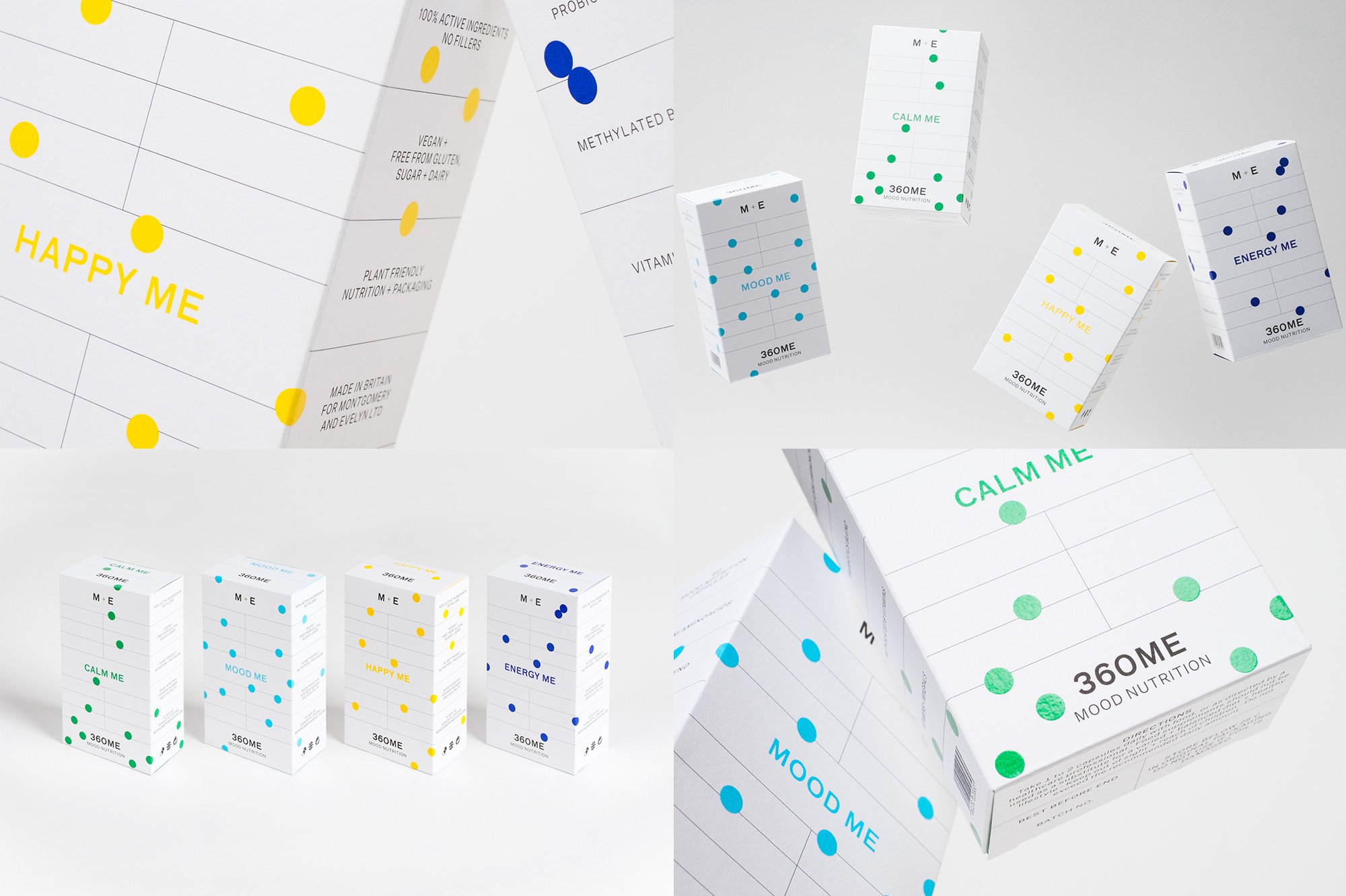
360ME is a new range of natural "mood nutrition" supplements created by Salisbury, UK-based psychotherapist, Evelyn Montgomery. Designed by Brighton, UK-based Studio Makgill, the packaging has a crisp and clean grid layout with a fairly clinical vibe but offset by the colorful dots that look like bright spots on gloomy days. The type all around the stark white boxes is quite nice and I just love how orderly everything is. In the package's own words: GRID ME. See full project