Noted: New Logo for Sheraton by Grey
“All Signs Point to S”

(Est. 1937) "Sheraton Hotels & Resorts, part of Marriott International, Inc., makes it easy for guests to explore, relax and enjoy the possibilities of travel at nearly 450 hotels in over 70 countries and territories around the world. Sheraton continues to enhance the brand through innovative guest experience, differentiating design, multi-channel marketing and a sharp focus on service."
Design by
Grey
Related links
Marriott International press release
Relevant quote
The new design reflects the brand’s holistic vision for the future, making Sheraton the central gathering place of communities around the world, welcoming guests and locals into a public space that embodies the modern town square vibe.
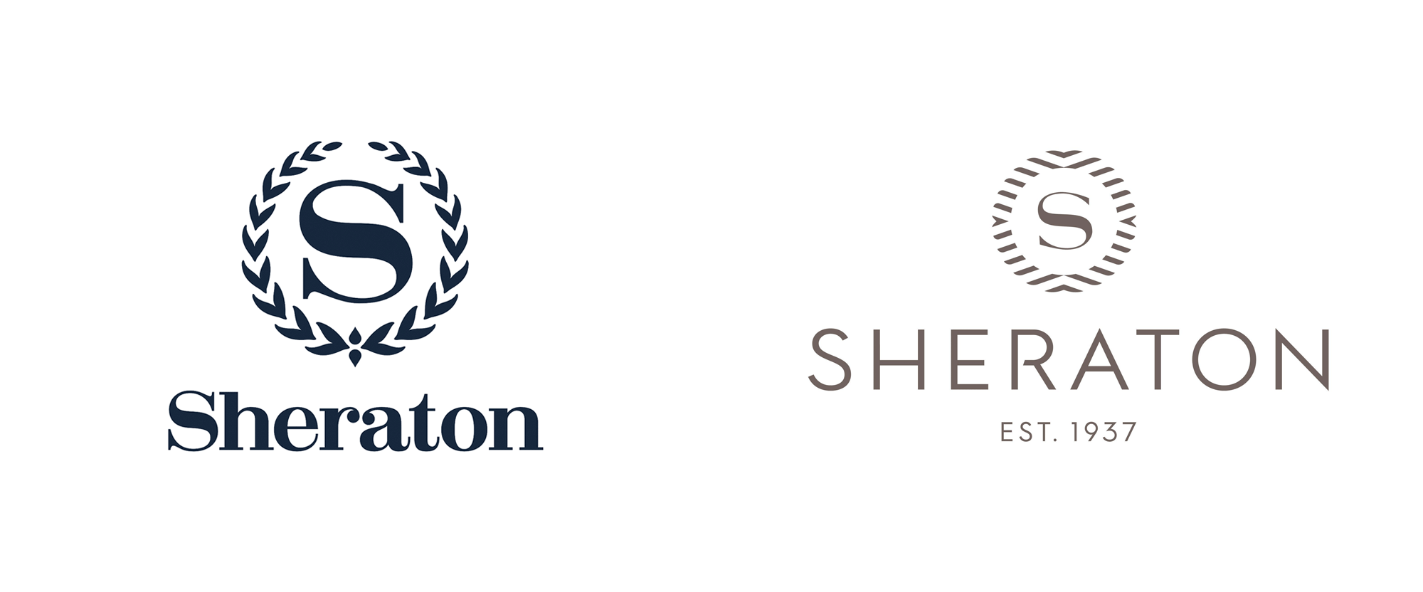
The new logo has been redesigned to signal an eye to the future while also hearkening back to Sheraton’s history. The new logo reimagines the signature laurel as movement from the world and the energy of gathering, which point to the modernized Sheraton “S” redrawn at the center.
Images (opinion after)

Opinion
The old logo was fairly iconic and recognizable. I don’t think it was a fantastic logo by any means but the combination of the laurels with the wide, elegant “S” gave it a kind of regal flair. The wordmark in a heavy Didone was starting to look dated but this was a logo that could have easily stayed the same for the rest of time. The new logo is a very strange mix of things, none of which are clearly related to either the legacy of the brand or to each other. The new “S” is actually nice — perhaps a little thin for small uses, but crisp and elegant. Had they applied the same approach to evolving the laurels and wordmark, this could have been an easy win. The laurels have been replaced by an abstract ring that, in principle, should work but there is something very clunky about the execution, especially in how the inner part of the ring looks like a blunt Adobe Illustrator mask as if they couldn’t figure out a better way to finish off the little shapes. The arrows are kind of interesting but I get a strong airline vibe more than hotel. The wordmark is the weakest part of this, having no relation to the central “S” or any of the shapes in the ring. The spikiness of the “A” and “N” is very uninviting, the low crossbar height is unnecessarily Art Deco-ish, and the notch in the “R” is confusing. Maybe something magical will happen in application but, so far, this is an unfortunate direction for such an iconic brand.


