
Noted: New Logo and Identity for An Post by Image Now

“Living in a Post-Postal World”
(Est. 1984) "An Post is a major commercial organization providing a wide range of services which encompass postal, communication, retail and financial services. It is one of Ireland's largest companies directly employing over 10,000 people through its national network of retail, processing and delivery points."
Design by
Image Now (Dublin, Ireland)
Related links
An Post brand page
Image Now project page
Relevant quote
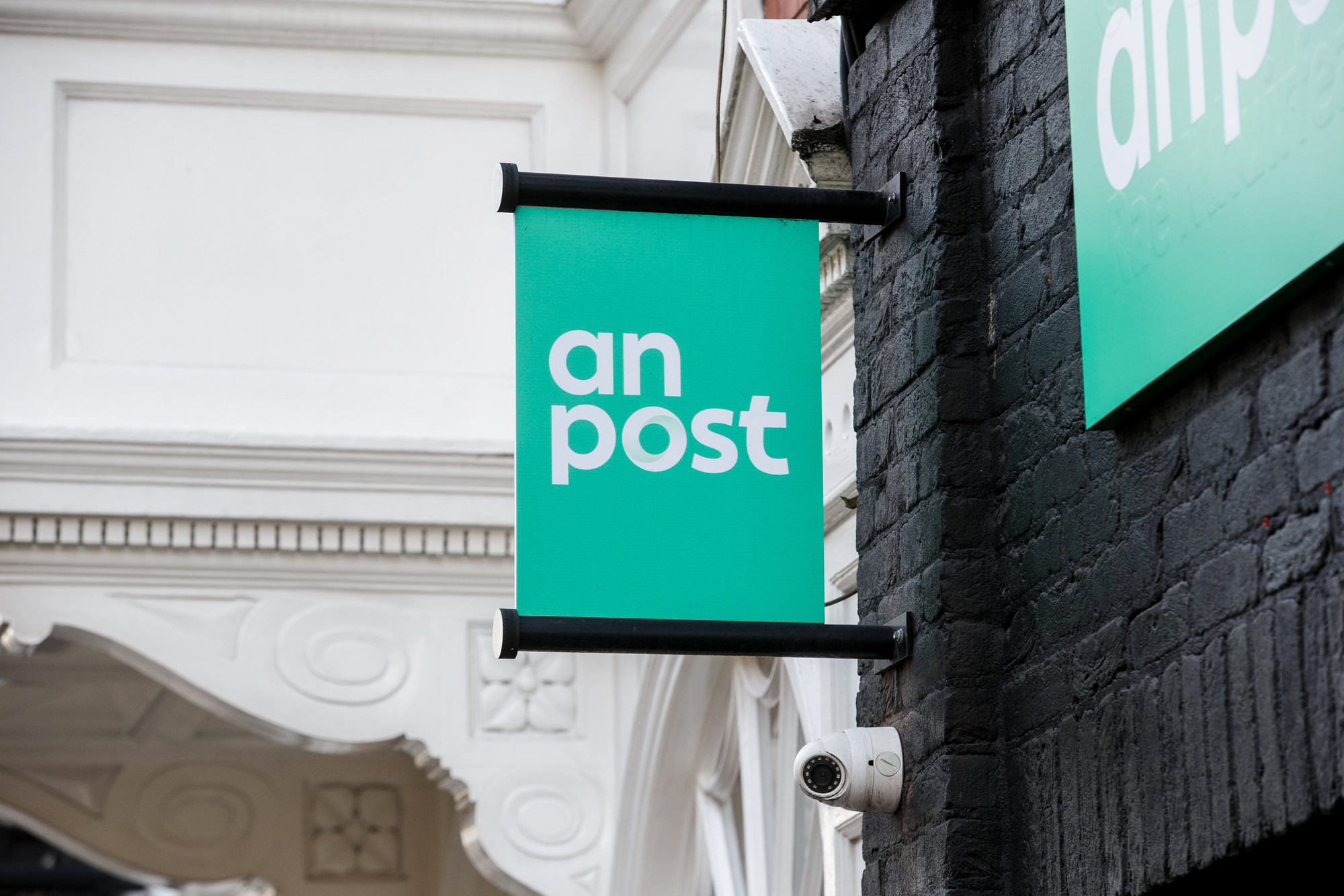
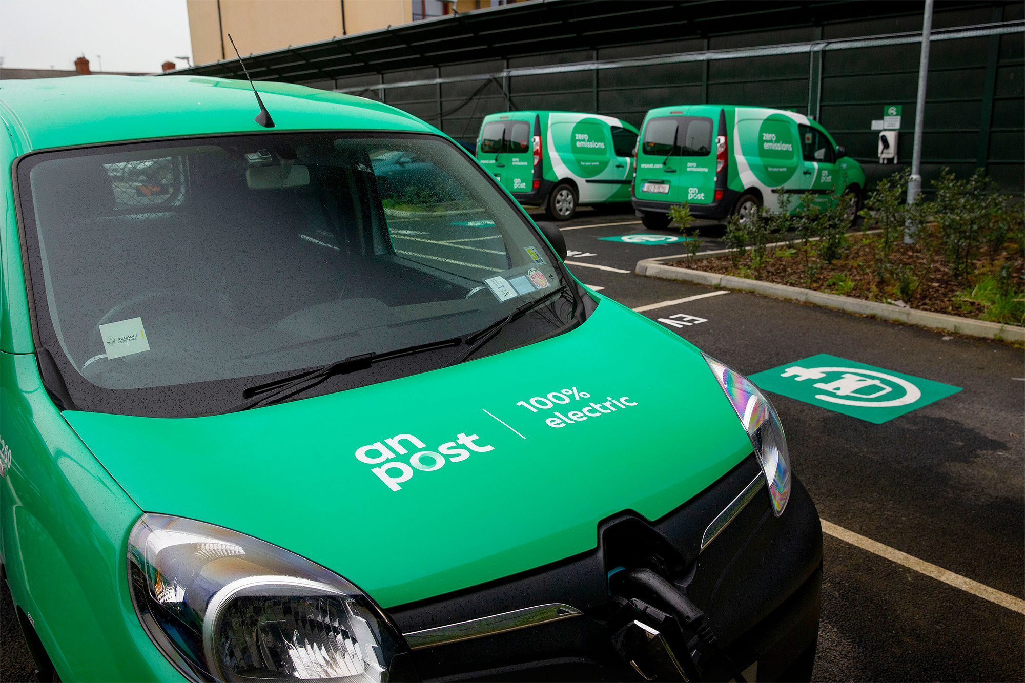
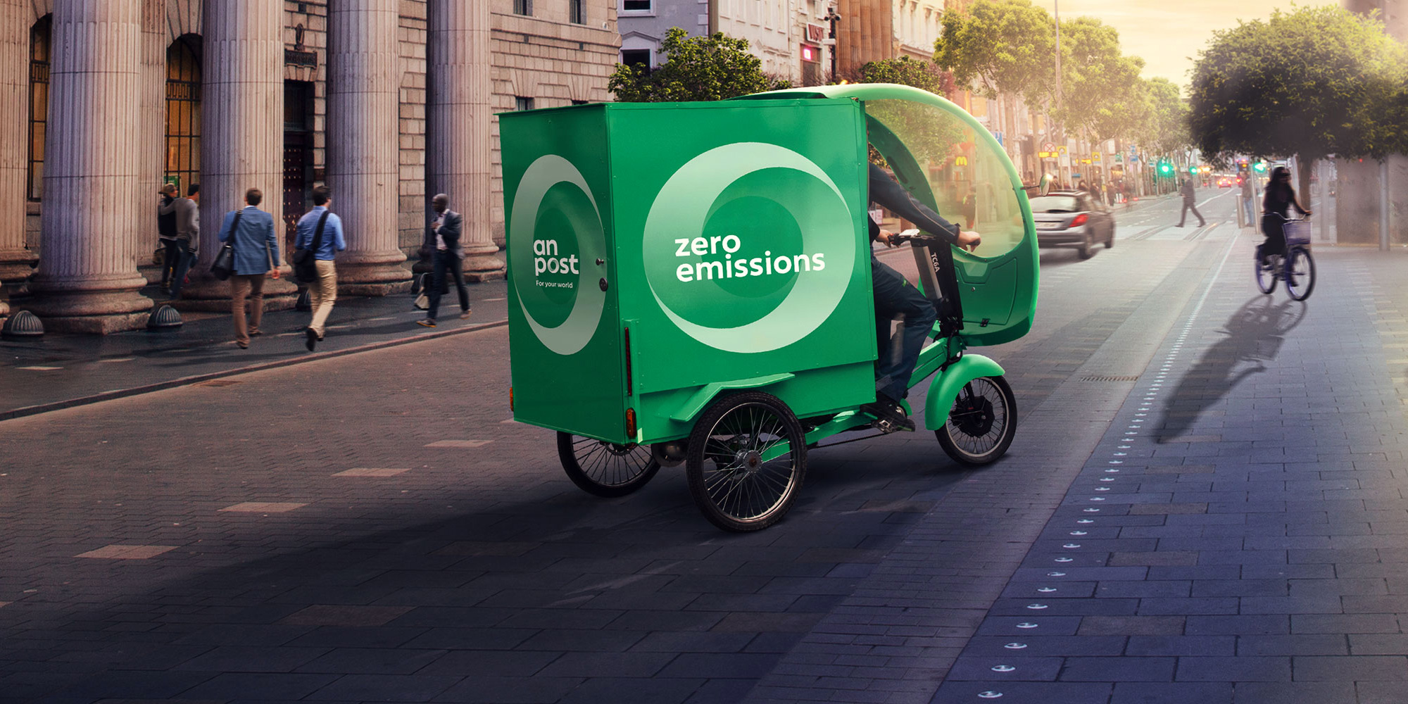
As part of our transformation, we’re having a makeover. We’re updating our logo, for the first time in 35 years, in a rebranding programme that will be phased in over the next three years. Visible change will be evident in post offices, online, across our fleet of vehicles and the uniforms we wear with pride. They will feature a more modern shade of green as well as our new logo, designed to symbolise ongoing change and connectedness.
Images (opinion after)

Opinion
The old logo wasn’t great but it wasn’t terrible. The wavy lines for the cancellation marking quickly conveyed that this was a postal service and the wordmark was interesting in its treatment of the “st” ligature. With the expansion of An Post into services beyond postal (including offering mortgages), the old logo was limiting so it’s understandable that they are going for a more “corporate” look, which the new logo has in spades. It’s not the most exciting logo but it’s also not the most boring logo. Its main problem is the two competing visual elements: the shaded, Möbius-strip-like “o” and the extra wide curved “t”. It’s hard to focus on one. I’m not a fan of the “o” as it feels somewhat clichéd but I totally get its appeal as a logo that represents change and connectedness — I don’t buy it but I get it. On the other hand, I really like the “t” and how it references the Gaelic “t” (which the old logo did as well). The peculiar letter is also part of the custom font deployed on An Post’s website and it adds a great distinctive element to an otherwise basic sans. Not much in application… some uses of the shaded “o” used large but that’s about it. The more vibrant and contemporary green is a great evolution to what looked like an old and dusty green. Overall, it’s a fine-enough job that gives the organization a boost.